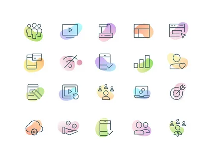
Discover everything you need to know about icon design – from key principles and modern trends to actionable tips that will elevate your UI/UX and branding.
Icons are a fundamental part of digital design. From websites and mobile apps to logos and user interfaces, icon design plays a crucial role in enhancing visual communication and improving user experience. In this guide, we’ll dive deep into what icon design is, why it matters, and how to create effective and visually appealing icons.
What is Icon Design?
Icon design is the process of creating graphic symbols that represent actions, objects, or ideas. These small visual elements help users navigate interfaces, understand functions quickly, and enrich the aesthetic of a digital product.
Whether it’s a hamburger menu, a shopping cart, or a home button, icons simplify information and reduce the need for text. A well-crafted icon can say more than a sentence – instantly and universally.
Why is Icon Design Important?
Here are a few reasons why icon design is vital in digital product development:
- Enhances Usability: Icons improve navigation and make user interfaces more intuitive.
- Saves Space: Instead of long labels, icons can represent actions with minimal real estate.
- Supports Branding: Custom icons can reinforce a brand’s visual identity.
- Improves Accessibility: When designed correctly, icons aid in making interfaces user-friendly for all, including those with language barriers.
Key Principles of Icon Design
To create effective icons, designers should follow these core principles:
1. Clarity
The primary goal of an icon is to communicate an idea quickly. Avoid overly complex or abstract designs. Icons should be easily recognizable at a glance.
2. Consistency
Maintain a uniform style throughout your icon set. This includes line weight, corner radius, color palette, and size. Consistency ensures your interface looks clean and professional.
3. Scalability
Icons should look good at all sizes. A good icon design retains its clarity and proportion whether it’s displayed at 16px or 256px.
4. Alignment with Context
Icons should be relevant to their function or context. A floppy disk still represents “Save” in many applications because it’s widely understood, even if outdated.
5. Simplicity
Great icon design often follows the “less is more” rule. Strip away unnecessary details while keeping the symbol understandable.
Best Practices for Icon Design
If you’re looking to master icon design, here are some tried-and-tested tips:
- Sketch First: Start with hand-drawn sketches. This allows for rapid ideation without worrying about pixel perfection.
- Use a Grid: Design icons using a consistent grid system (commonly 24×24 or 32×32 pixels). This ensures alignment and balance.
- Mind the Stroke Weight: Choose a consistent stroke weight that fits your overall design. Thin strokes are elegant, while thick ones feel bold and modern.
- Test in Context: Always preview your icons in the actual UI or mockup. What looks good in isolation might not work well in practice.
- Export in SVG: Scalable Vector Graphics (SVG) format ensures crisp, resolution-independent icons that work on all devices.
Tools for Icon Design
Whether you’re a beginner or a seasoned designer, the right tools can streamline your workflow. Here are some popular options:
- Figma – Great for collaborative design and prototyping.
- Adobe Illustrator – Industry-standard for vector graphics and precision design.
- Sketch – Mac-only design tool widely used for UI/UX.
- Affinity Designer – Affordable alternative with professional-grade features.
- IconJar or Nucleo – Ideal for managing and organizing large icon libraries.
Icon Design Trends in 2025
Like all design fields, icon design evolves with technology and user expectations. Here are a few trends dominating 2025:
- Minimalism – Clean lines and flat colors remain popular.
- 3D & Gradients – Soft 3D effects and color gradients add depth without overwhelming.
- Animated Icons – Microinteractions using animated SVGs make interfaces feel alive.
- Hand-drawn Icons – Add a personal touch to websites and apps with sketch-style visuals.
Conclusion
Great icon design blends function with form. It’s not just about looking good—it’s about improving usability, supporting navigation, and reinforcing your brand’s message. Whether you’re designing for mobile apps, websites, or desktop software, understanding the basics of icon design is essential for any digital designer.
By following the principles and tips outlined above, you can create icons that are not only beautiful but also functional and user-centric.

