Color theory is a fundamental concept in the world of design, art, and visual communication. It serves as a guide for mixing colors and creating visually appealing compositions. Whether you’re a graphic designer, interior decorator, artist, or marketer, understanding color theory can significantly impact your work. In this article, we’ll explore the basics of color theory, its importance, and how it can be applied across various creative disciplines.
What is Color Theory?
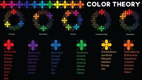
Color theory is the science and art of using color. It explains how colors interact with each other, how they can be combined, and the emotional responses they evoke. The foundation of color theory lies in the color wheel, a visual representation of colors arranged in a circular format. This tool helps artists and designers understand the relationship between primary, secondary, and tertiary colors.
The Color Wheel
The color wheel is divided into:
- Primary Colors: Red, Blue, and Yellow. These colors cannot be made by mixing other colors.
- Secondary Colors: Green, Orange, and Purple. These are created by mixing two primary colors.
- Tertiary Colors: These are formed by mixing a primary color with a secondary color, resulting in hues like red-orange, yellow-green, and blue-purple.
Understanding the color wheel is the first step in mastering color theory.
Color Harmony and Combinations
One of the essential principles of color theory is color harmony. Color harmony refers to aesthetically pleasing color combinations that create a sense of balance and order. Here are some popular color schemes based on color theory:
1. Complementary Colors
These are colors located directly opposite each other on the color wheel (e.g., blue and orange, red and green). Complementary colors offer high contrast and can make elements stand out, making them ideal for call-to-action buttons or focal points in designs.
2. Analogous Colors
These colors sit next to each other on the color wheel (e.g., blue, blue-green, and green). Analogous color schemes are soothing and pleasing to the eye, often used in interior design and branding to create a harmonious look.
3. Triadic Colors
A triadic color scheme involves three colors evenly spaced around the color wheel (e.g., red, yellow, and blue). This combination provides high contrast while retaining balance and richness.
4. Monochromatic Colors
This scheme uses different shades, tones, and tints of a single color. Monochromatic designs are elegant and cohesive, often used in modern, minimalist aesthetics.
The Psychology of Color
Color theory also delves into the psychological effects of colors. Different colors evoke different emotions and associations:
- Red: Energy, passion, urgency
- Blue: Trust, calm, professionalism
- Yellow: Optimism, warmth, happiness
- Green: Growth, nature, harmony
- Purple: Luxury, creativity, spirituality
- Black: Power, sophistication, mystery
- White: Cleanliness, simplicity, purity
Marketers and designers use these associations to influence consumer behaviour and convey brand messaging.
Applications of Color Theory
1. Graphic and Web Design
In digital design, color theory ensures that websites and graphics are visually appealing and accessible. It helps designers choose color schemes that enhance readability and usability.
2. Interior Design
Interior decorators use color theory to create mood and atmosphere in a space. For instance, cool tones like blue and green are often used in bedrooms to promote relaxation, while warmer tones like red and orange can energize a kitchen or dining area.
3. Fashion
Fashion designers apply color theory to craft seasonal collections and outfits that evoke emotion, highlight features, or reflect trends.
4. Branding and Marketing
Brands rely heavily on color to differentiate themselves. A strong understanding of color theory helps marketers select brand colors that resonate with their target audience and convey the right message.
Tips for Using Color Theory Effectively
- Use the 60-30-10 rule in design: 60% dominant color, 30% secondary color, and 10% accent color.
- Test colors on different devices or lighting conditions to ensure consistency.
- Use tools like Adobe Color or Coolors to create harmonious palettes based on color theory.
- Consider cultural differences in color meanings when designing for a global audience.
Conclusion
Color theory is more than just mixing colors; it’s about understanding the relationships between colors and how they influence perception and emotion. By mastering the principles of color theory, you can create designs that are not only visually appealing but also impactful and memorable. Whether you’re painting a masterpiece or building